Posts

Portfolio

Image
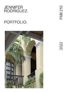
Below is the portfolio including all the work done for my FMX 210 class. It was based on a minimalist aspect that I love. Minimalistic with a magazine touch. The cover photo is a personal photo of a hotel in Puerto Rico called 'El Convento.' The other photos included were candid pictures taken of me during class. Putting this portfolio together was easy and incredible to piece one by one and describe my work over the semester. Such an incredible experience and InDesign was, perhaps, one of my favorite programs during the whole class. Incredibly innovative and easy to work with.   
Image
My business cards were inspired by cards I'd happily give to people I meet by chance in the street. It touches on a lot of my personality, especially the Monet one.   

ID Videos

Image
 Youtube Channel, 'Yes, I'm a Designer' has a full tutorial focused on InDesign and the masking tools for users. This is a great beginner and in-depth tutorial for those who are curious about the Adobe program.  LYH Studio focuses on a basic overview of the InDesign program and its tool in a quick video. It was beneficial for understanding color theory and the mechanics of swatching in InDesign.  Another video by LYH Studio with being 2 minutes longer than the other one which he touches on the pages and property features in InDesign 

Somewhere

Image
  Fleabag has been one of the most influential shows for me in the past 2 years. I took one of my favorite scenes from Season 2, Episode 1 where they're all gathered at dinner.  I had to photoshop one of the characters, Martin, out to proportionally fit myself into his position. This was quite fun to make. 

Photoshop #2

Image
  This picture from Kirby Jenner's instagram seems to be a difficult one to photoshop myself into because of proportions.  Rob's picture were pretty mediocre but seeing pictures of his travels reminded me of my favorite foreign films and TV shows that I coud photoshop myself into  super interesting take. Instead of addign another person, just adding something to the background.  This illusion was pretty interesting to see. Might not recreate it but can definitely learn a lot from it because it is about photoshopping off the body holding up the legs, photoshopping background and light, and also the illusiong of the dress. An incredible skill 

Photoshop #1

Image
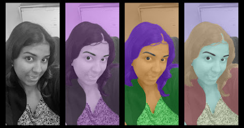
  Photoshop from BW to Analogous  Using a casual picture from work seemed like a simple image to work with. This project was more straightforward than with previous programs and quite fun after figuring out Photoshop.  This is the original selfie I started working from. I wanted to just work on my main features. Focusing on the face, hair, shirt, and jacket.  Turning the  image to grayscale was  the first step before choosing my colors on Adobe Colors. This was my favorite to work with. I used the Swatches tool to save all the colors to make them easier to work with. Monochromatic  had all my favorite shades of purple and I wanted to maintain a primary solid color for the background.  Analogous was not my favorite, it had my favorite type of colors which were pastels. I had a hard time trying to mix the colors and make them look good. Compared to the other ones, I loved the color purple and didn't want to keep making it purple in this one.   ...

Photoshop Videos

Image
  Webflippy's Youtube channel focuses on Photoshop Tutorials. This video centers on a simple yet effective affect of making an object in a picture obtain a glowing effect. The most common tool used was the blending tool which seems fairly easy but also has a variety of blending options. There was not much information in the video to provide explanation for each tool but did show the diversity of forms within the blending tool.  MDMZ's video does something many people in current social media do to curate their feed. People love to photoshop themselves in destination and use a different pictures to sell a perspective to their audience. I loved this video in particular because it is a slower paced to understand the how to edit all these pictures one-by-one. This is a great example of modifying and blending that can be done in photoshop that can make it seamless. Most of the tutorials included in this post always use the selection tool to work off from. The hardest tool seem to be...

Self Portrait/ Propaganda Poster

Image
  Adobe Illustrator was a bit harder to use this time around as I couldn't get the colors correct since the dropper would give such different shades, it became difficult. I used the mesh tool for the face to add discrete contour. The mesh mostly worked on the lips best because the face and neck path anchors were hard to manage.  Translation: Liberty or Nothing Statement: I believe propaganda holds a huge significance in our society. It has motivated and pushed large populations to defend their patriotism and country, It calls to action the injustices their country has suffered and asking its natives to fight back.  As someone who has both Puerto Rican and Cuban heritage, both my countries are struggling through tyranny, under the shackles of colonization and embargos.  Most of the inspiration comes from both my countries, heavily inspired by Cuban propaganda during the Cuban Revolution. One significant figure that is constantly shown in posters is Argentinian Marxist...

Calligram

Image
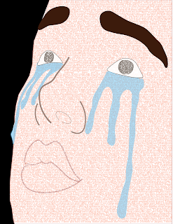
  I used a sad image to juxtapose the letter written to my future self. The letter is full of nostalgia and hopefulness for a more fulfilling future.  I started by outlining the reference image using the pen and curvature tool to make the contours of the face. I made a complete path for the full face since that was the main section I wanted to fill with the letter. Then, using the Area Type Tool I filled the face with my letter pasted around 12 times. Using the Helvetica font at 8 points and barely any space between the letters. After outlining everything, I filled the lips with the beginning of the letter as well and underlined the path at the bottom of the words so they were noticeable enough. Using the dropper tool, I tried looking for colors similar to the reference image. Using the ellipse tool for the eyes so I could also include part of my letter in it. Originally, the eyes were going to be blank but I wanted extra features with the letter. There are approximately 8 lay...

Adobe Illustrator Tutorials!

Image
  Illustrator Tutorial #1 'Yes, I'm a Designer' is a YouTube channel dedicated to tutorials for artists and graphic designers. The video provides an introductory look into making illustrations in the design application, Adobe Illustrator. He gives the user a simple explanation of copying other works to help them practice. He describes how simple shapes and shadows can help create a good illustration. The first tool presented is the pen and how to create curvatures to the lines placed. His example is an outline of a flame. He then shows the feature for rounding corners of shapes make with the lines. He uses the shape of a star and shows right-click features that are included to edit the corner's radius, width, and curvature. By the middle of the video, he has explained how to fill in colors and how to add different variations of color around illustrations to give them depth. At the end, he uses much more advanced skills for graphic designers such as working with fonts an...

Canvas Final Project

Image
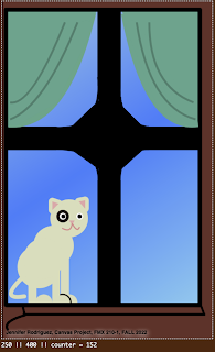
Cat by window             Trying to find inspiration for this project was a little hard. While walking through the city of Tampa, I stopped by a cafe in front of an apartment complex. By the corner of the building, on a window sill, was a cream-and-black spotted cat standing outside the window. I tried recreating it through sketches but struggled in the end result. I used bezier cures, triangles, circles, too many triangles, and small quadratic curves to fill in the curves in curtains. In the end, it took me 8 hours to do this. I had too much difficulty with figuring out the mathematical formulas for the shapes.  I was inspired by anime backgrounds as well. Anime has simplistic lines that can curate such complex animations. That was very interesting to use as a reference.  My sketch was angled from my point of view, when it came to start coding the canvas it became difficult to continue in the perspective that I wanted.  <!doctyp...