'Yes, I'm a Designer' is a YouTube channel dedicated to tutorials for artists and graphic designers. The video provides an introductory look into making illustrations in the design application, Adobe Illustrator. He gives the user a simple explanation of copying other works to help them practice. He describes how simple shapes and shadows can help create a good illustration. The first tool presented is the pen and how to create curvatures to the lines placed. His example is an outline of a flame. He then shows the feature for rounding corners of shapes make with the lines. He uses the shape of a star and shows right-click features that are included to edit the corner's radius, width, and curvature. By the middle of the video, he has explained how to fill in colors and how to add different variations of color around illustrations to give them depth. At the end, he uses much more advanced skills for graphic designers such as working with fonts and such.
The first video was helpful in giving me a small rundown on what possibilities can be done through the Illustrator application. Whereas, Youtube channel 'Andy Tells Things,' gives a quick guide to all the tools provided in Adobe Illustrator along with their keyboard shortcut codes. The guide is more of technical use for all of them instead of creativity, yet still helpful for beginners. He encourages in the video for everyone to take time out their day to learn these tools at their own pace and only use his videos to get commonground on what Adobe Illustrator has to offer.
Paola Kassa is a Graphic Design YouTuber who specializes in Adobe Illustrator for her career. She opens the video with an explanation for why she has switched from Adobe Photoshop to Adobe Illustrator. She answers concerns for those who are starting out on Illustrator. While she shows the process of the application, she explains on the side how Illustrator's versatility has helped improve her design skills. She mentions how the application invites the user to practice their skills in diverse forms.
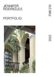
Below is the portfolio including all the work done for my FMX 210 class. It was based on a minimalist aspect that I love. Minimalistic with a magazine touch. The cover photo is a personal photo of a hotel in Puerto Rico called 'El Convento.' The other photos included were candid pictures taken of me during class. Putting this portfolio together was easy and incredible to piece one by one and describe my work over the semester. Such an incredible experience and InDesign was, perhaps, one of my favorite programs during the whole class. Incredibly innovative and easy to work with.
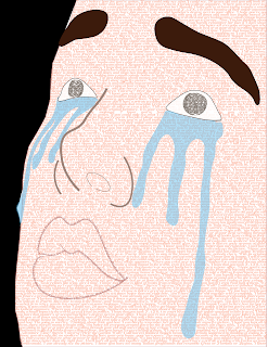
I used a sad image to juxtapose the letter written to my future self. The letter is full of nostalgia and hopefulness for a more fulfilling future. I started by outlining the reference image using the pen and curvature tool to make the contours of the face. I made a complete path for the full face since that was the main section I wanted to fill with the letter. Then, using the Area Type Tool I filled the face with my letter pasted around 12 times. Using the Helvetica font at 8 points and barely any space between the letters. After outlining everything, I filled the lips with the beginning of the letter as well and underlined the path at the bottom of the words so they were noticeable enough. Using the dropper tool, I tried looking for colors similar to the reference image. Using the ellipse tool for the eyes so I could also include part of my letter in it. Originally, the eyes were going to be blank but I wanted extra features with the letter. There are approximately 8 lay...
Youtube Channel, 'Yes, I'm a Designer' has a full tutorial focused on InDesign and the masking tools for users. This is a great beginner and in-depth tutorial for those who are curious about the Adobe program. LYH Studio focuses on a basic overview of the InDesign program and its tool in a quick video. It was beneficial for understanding color theory and the mechanics of swatching in InDesign. Another video by LYH Studio with being 2 minutes longer than the other one which he touches on the pages and property features in InDesign

Comments
Post a Comment